GUIComp A Real-Time, Multi-Faceted GUI Design Assistant
📝 Original Paper Info
- Title: GUIComp A GUI Design Assistant with Real-Time, Multi-Faceted Feedback- ArXiv ID: 2001.05684
- Date: 2020-01-17
- Authors: Chunggi Lee, Sanghoon Kim, Dongyun Han, Hongjun Yang, Young-Woo Park, Bum Chul Kwon, Sungahn Ko
📝 Abstract
Users may face challenges while designing graphical user interfaces, due to a lack of relevant experience and guidance. This paper aims to investigate the issues that users with no experience face during the design process, and how to resolve them. To this end, we conducted semi-structured interviews, based on which we built a GUI prototyping assistance tool called GUIComp. This tool can be connected to GUI design software as an extension, and it provides real-time, multi-faceted feedback on a user's current design. Additionally, we conducted two user studies, in which we asked participants to create mobile GUIs with or without GUIComp, and requested online workers to assess the created GUIs. The experimental results show that GUIComp facilitated iterative design and the participants with GUIComp had better a user experience and produced more acceptable designs than those who did not.💡 Summary & Analysis
This paper introduces GUICompanion (GUIComp), a tool designed to help users with little experience in designing graphical user interfaces (GUIs). The primary issue addressed is the difficulty novice users face during the design process due to lack of guidance and experience, leading to challenges such as conceptualizing designs on a blank canvas and harmonizing concepts within given constraints. GUIComp integrates real-time feedback mechanisms—recommendation, evaluation, and attention—to assist in designing mobile GUIs.The tool provides recommendations based on a dataset of existing GUI designs, evaluates the visual complexity of user designs using metrics, and highlights areas that may attract more attention from users. The experimental results demonstrate that participants who used GUIComp produced more acceptable designs as evaluated by online workers and reported higher satisfaction with their design process compared to those without GUIComp.
The significance lies in providing a real-time feedback system for novices, enabling them to overcome common obstacles encountered during the design phase and facilitating an iterative design approach. This not only improves the quality of the final product but also enhances user experience and satisfaction throughout the design process.
📄 Full Paper Content (ArXiv Source)
This section describes lessons we learned from this study and discusses limitations of our work.
Provide Explanation for Feedback or Allow Users to Intervene in the Feedback Generation Process: We believe design assistance tools can further support users by providing additional feedback for “why" (justified feedback ) to help users better understand the reason for the given feedback. In this study, participants requested justified feedback in GUIComp when the feedback was not clear. For example, a few participants often wanted to know exactly which areas or elements contributed the most negatively to the evaluation score. P6 struggled to find areas for improvement, and stated, “I designed in a way to increase my alignment score, but the score did not go up as I intended." The same issue occurred with the recommendations. When we asked how we could improve GUIComp, P5 commented, “There were many recommended examples, but I could not understand why some examples were recommended to me." Users wanted to understand the reasons for the scores and the recommendations.
One solution is to provide a relevant explanation for the feedback. For example, when a user does not understand a low score in alignment, an assistance tool can point out the misaligned elements, so users can take appropriate actions. Another solution is to include users in the automated process. For example, users can be invited to intervene in the example recommendation process. After viewing the initial suggestions, users may provide feedback by setting constraints on desired designs (e.g., background color) or by directly labeling selected examples as “good" or “bad." We can consider providing more granular feedback using semantics of UIs , by referring to what each visual element means and how it is supposed to be used, in order to help users better interpret the results. Future research may investigate how to make the system’s feedback more interpretable and how to incorporate users’ feedback in the system’s feedback.
Conflict between User Thought and Feedback: In this study, we provided participants with three types of feedback. The participants often struggled with feedback that was opposite to what they believed. In particular, some participants were reluctant to accept numeric scores in the evaluation panel. In the experiment, P14 intentionally changed the layout so that some elements were overlapping. This action decreased the evaluation scores. After the experiment, P14 stated, “Though I saw my scores dropped as I made the element overlap, […] I still think my (overlapping elements) design looks better than others with high scores.” The strength of numeric scores is the clear interpretability. However, when the scores do not match what users believe, the scores may not be appreciated. In addition, the evaluation scores, which do not reflect subjective elements, layouts, or themes, may be disregarded. Future research should investigate how to reconcile the potential conflicts either by augmenting the numeric score with more convincing, descriptive, textual feedback or by improving the feedback using users’ input.
Automation and Feedback: As we discussed above, the participants often demanded more explanations and explicit guidance. In this study, we provided feedback in a non-intrusive manner so that the users could be able to contemplate the feedback for themselves. In this way, we believe that users can lead their design efforts using their creativity . However, the participants revealed that they would have appreciated some automated correction of details, such as misalignment. Future research should investigate the effects of such automated designs or corrections on the users’ experience, and quality of their work. For instance, an automated GUI and code generation technology from a GUI screenshot is one of the emerging technologies in GUI prototyping, including pix2code , ReDraw , and DesignScape . However, other studies report that auto-generation can take the imagination of developers out of the design process and remove opportunities for learning how to improve designs . In addition, there is a wide design space between automation and manual design. Future studies should investigate how to integrate automated support, while facilitating user-driven, creative design processes for GUIs.
Limitations and Future Work
As our goal was not ranking the features, we could not report report superiority and interplay effects among the features in this work. As our experiment was with the novices and Kakao Oven, we could not tell the effectiveness of our approach with experienced users and other baseline tools. We plan to conduct an experiment for comparing and ranking the features and for investigating the effect of our approach with more experienced users and other tools.
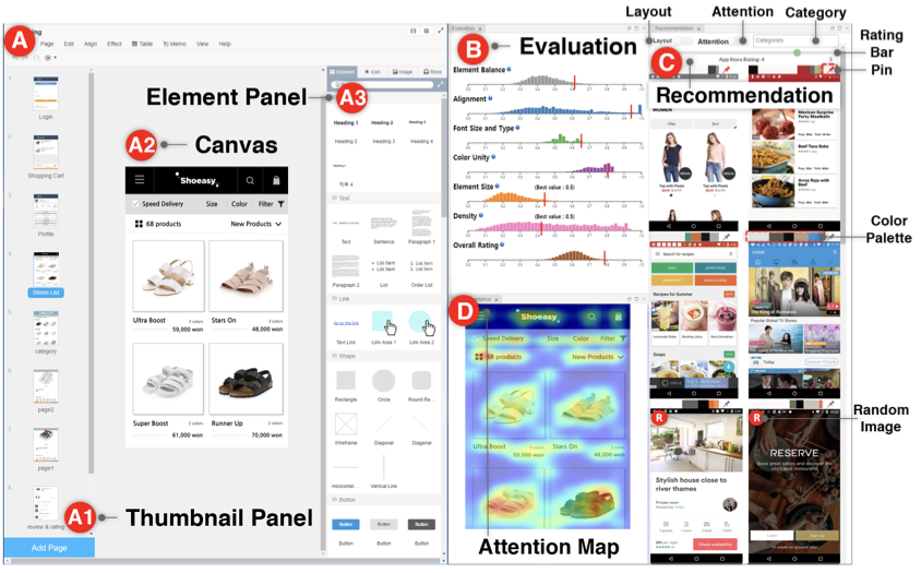
GUIComp: An Add-on for GUI Design Guidance
We introduce a web-based add-on tool, called GUICompanion (GUIComp), which provides prompt feedback on GUI designs. GUIComp is designed as an add-on for mobile GUI design applications so that it can be easily adapted to any other tool with proper configuration of client-server communication.
 style="width:85.0%" />
Tool Overview
GUIComp consists of three panels (the evaluation, recommendation, and attention panels), where each panel fulfills the three requirements (i.e., R1–R3) described in the previous section. We implemented the tool in the Chrome browser as an extension that uses responsive web technologies to capture and process information in real time (R4), and provides feedback in a separate window outside the user’s design canvas (R5). As an extension, GUIComp can be linked to any online GUI prototyping tool (R6). For demonstration and evaluation purposes, we linked GUIComp to Kakao Oven , a base GUI prototype tool. GUIComp captures the most up-to-date design states by using open source libraries (i.e., MutationObserver), generates feedback (i.e., visual complexity evaluation), recommendation templates, and attention heatmaps based on the states, and presents them on the three panels (1 B–D). In the following sections, we describe how we captured the users’ design states, parsed the web elements, and extracted the design elements (e.g., element types, dimensions, and color maps) and we subsequently introduce the panels, metrics, and datasets used for GUIComp.
Capturing and Processing Users’ Design on Canvas
GUIComp captures user design states and returns two different outputs, HTML elements and images. Then, using the two outputs as inputs, GUIComp generates three different types of feedback (examples, evaluation scores, and attention heatmaps). When there is an interaction on the user canvas (1 A2), an internal HTML file for describing the user canvas is also updated. Once an update is detected by using MutationObserver, a JavaScript API, GUIComp converts the HTML file into a json file using the html2json and html2canvas libraries. GUIComp saves the json file temporarily in the Chrome extension’s local storage to prevent Cross-site Request Forgery (CSRF) vulnerabilities. Then, GUIComp sends the json file to the processing server along with an image of the GUI on the canvas.
The processing server extracts GUI components’ ID, type (e.g., button), and attributes (e.g., color, width, and height) from the json files and computes i) the dominant colors using OpenCV and ii) the visual complexity scores using the equations proposed by Riegler and Holzmann , which are described further in the Evaluation Panel section. GUIComp also captures and stores the GUI image from the canvas; see 1 A2. The captured GUI image is used as an input for the FCN-16 model, and the model provides an attention map score as an output.
Recommendation Panel
Description of In-the-Wild Mobile GUI Data (RICO)
To create a pool for recommendation templates, we considered both the ERICA and RICO datasets , but chose to use RICO, as it includes one of the most extensive lists of mobile application screenshots. The RICO dataset contains 72,219 mobile application GUI screenshots, meta-data, and element hierarchy information from 9,700 Google Play Store popular apps. The dataset also contains meta-data of the applications, including the average rating, the number of installs and downloads, and the category assigned for the app marketplace. The average ratings and categories of the apps are utilized for filtering examples in 1 (C). We manually reviewed each screenshot and excluded those that were inappropriate for use in GUIComp. Specifically, we excluded screenshots of playing games, commercial advertisements, pop-up menus, Android basic screens (e.g., the home screen), data loading, password typing, black images, web views, and maps. In the end, we used 6683 screenshots from 2448 applications for this work.
Generating Recommendations from HTML
From the HTML file, the GUI structure information (e.g., TextView, EditText, Button, ImageView, and ImageButton) is also extracted and used as an input for Stacked Autoencoder (SAE) and the k-nearest neighbor algorithm, as suggested by Deka et al. for recommending examples that are similar to the current GUI on the canvas. In our implementation, the encoder has 13,500 (90$`\times`$50$`\times`$3) input (the image size is the same ratio as the RICO dataset) and 64 output dimensions with two hidden layers of 2048 dimensions and 256 dimensions with the ReLU activation function . The decoder has the same but reversed architecture of the encoder. For training and recommendation, we used the RICO dataset. We used 90% of the data (6154 images) for training and kept the rest for validation. We used the Adadelta optimizer and mean squared error as the loss function. During the training, the validation loss was stabilized at 4.96 after about 1900 epochs for 1.5h with 512 batches. Using the trained model, we generated a 64-dimensional representation per GUI screenshot for the RICO dataset. The k-nearest neighbor algorithm was implemented with the brute search algorithm and the cosine distance metric.
Presenting Similar and Random Examples
The recommendation panel provides users with example templates that are relevant to and inspirational for their design goals. It is not feasible to present all examples from the RICO dataset to users and ask them to explore the list without any guidance. Furthermore, as users make progress in their designs, they might need different examples for different purposes. Thus, our goal was to provide a list of the most relevant examples at the moment based on the current state of the design. To achieve this goal, we computed similarity scores between the user’s design and examples so that we could rank the examples in the order of similarity.
In addition to similar examples, we decided to present “random (four images)” examples for two reasons. First, giving random examples increases diversity in design choices, as the standard affinity algorithm can generate recommendation lists that are similar . Second, users can rethink the choices they made (e.g., the layout). By viewing intriguing alternatives, users may have a chance to think outside the box. To distinguish random examples from recommended examples, we show a visual mark (), as shown in 1 C (bottom). When there is no component on the user canvas (e.g., at the beginning), the panel is populated with random examples.
We speculated that users might want to “keep” some templates while changing others as they make progress. Thus, we allowed users to pin examples so that they maintain the selected examples in the list; they can also unpin the examples (1 PIN ). The panel also lists dominant colors in their color palettes (e.g., 1 Color Palette ) generated from the OpenCV library. When a user hovers over a color in the palette, the RGB information of the color is shown to help users refer to and learn the combinations of colors in the examples. When a user clicks on an example template, the user canvas is cleared and then elements of the clicked template populate the user canvas in the same layout and alignment as shown in the template. To allow this automated element-populating function, we first mapped the information of the RICO leaf-level nodes (e.g., x, y, width, height, and type) to that of the Kakao Oven elements (1 A3), and computed the ratio of RICO’s nodes to screen width and height and Oven’s elements to the canvas width and height. Then, the drag–mock library updates the HTML code to indicate that new elements were added. Note that users can recover previous designs by using a revert function provided by the base tool.
Attention Panel
To visually show how much attention will be paid to elements on a GUI design (R3), we incorporated Bylinskii et al.’s attention model . We feed the captured image from the user design on the canvas into the attention model (FCN-16) that has been pre-trained with a graphics design importance (GDI) dataset to produce a heatmap with pixel values ranging from 0 to 255. 1 D shows an attention heatmap with the given GUI on the canvas in 1 A2. The color map used in the heatmap linearly ranges over blue-green-yellow-red, where the red indicates the areas that will receive the most attention. The more intense the red on an element on the heatmap, the higher the importance of the element in the attention map. Guided by the heatmap, users can expect where viewers will direct their attention. Based on the information, users can revise the design for optimal guidance. With the attention map, users can balance the expected audience’s attention by revising the original design. For example, when a text field unintentionally receives too much attention, a user may change the position or size of the text to redirect the audience’s attention to more important areas.
Evaluation Panel
Generating Visual Complexity Metrics
To provide feedback on GUI quality (R2), we incorporated visual complexity metrics. We also expected that, by using the metrics as evaluation rubrics, users could easily discern possible issues in their current design . A review of previous studies that involved experimental evaluation enabled us to find two candidate metrics . Of the two metrics, we chose the one by Riegler et al. because it enables real-time evaluation (R4) and allows for an easy-to-understand numerical result presentation. From the authors’ original seven metrics, we excluded two: the number of UI elements and inconsistency. We omitted the former because the absolute number of UI elements does not reflect the quality of a design, given that the number varies depending on the design goal. We eliminated inconsistency because it applies only when a design has more than one GUI page. We also modified the original metric names into more intuitive ones to help users understand the terms. Specifically, we changed imbalance to element balance, misalignment to alignment, color complexity to color unity, typographic complexity to font size and type unity, and element smallness to element size. We did not change the term density. For metrics that feature 0 as the best score (i.e., element balance, alignment, color utility, and font size and type unity), we reversed the score range from 1 to 0 to 0 to 1 so that 1 became the best score. We did not convert the scores for element size and density because the midpoint (i.e., 0.5) is considered the best score for the metrics . These metrics were also used as rubrics for the evaluation by the online workers. We describe the metrics in detail as follows: Element Balance (best score: 1.0) refers to the overall symmetry, balanced element distribution (e.g., consistent space between elements), and skewness of the elements. Alignment (best score: 1.0) pertains to the checking of alignment among elements. During computation, three vertical (left, middle, and right) and three horizontal (top, middle, and horizon) imaginary lines are drawn for each element to measure the score. Color Unity (best score: 1.0) shows the color use based on the ratio of dominant to non-dominant colors. Font Size and Type Unity (best score: 1.0) investigates the consistency of font sizes and types present in the text. Element size (best score: 0.5) is intended to verify whether elements are excessively small or large for mobile interfaces. Scores lower than 0.5 mean the elements are small, while scores higher than 0.5 imply the elements are large, on average. Density (best score: 0.5) computes how much space is occupied. Scores of less than 0.5 translate into simplicity in design, whereas higher scores imply over-populated designs.
Presenting Visual Complexity Scores with User Ratings.
To help users understand the strengths and weaknesses of their current design compared to those in the RICO dataset (R2) , the evaluation panel (1 B) presents six visual complexity scores and one overall rating score for the user’s current design. This panel uses six histograms, each of which shows the distribution of examples in the RICO dataset with its corresponding complexity score on a horizontal scale. The vertical red bar on each scale shows how high or low the corresponding visual complexity score of the user’s design is compared to that of the examples. For instance, the example design in the user canvas (1 A2) can be evaluated as a high-quality design based on the positions of the red bars over the distributions in each evaluation dimension (1 B).
To support R4, GUIComp computes new scores whenever a user interaction occurs over the design canvas (A2). For example, when a button element is dragged from the element panel (A3) and dropped to the canvas (A2), the evaluation panel updates with newly computed scores to present the effects of the dropping of the button. Note that the current design’s scores are marked with a thick, vertical, red bar in each histogram (1 B). The scores of the recommended examples are depicted with black bars when a user hovers over an example in the recommendation panel.
Implementation Notes
We used two servers: one (Intel Xeon E5-2630, 2.40GHz, 128GB RAM) for processing the captured user interaction and the other (Intel Xeon E5-2630, 2.20GHz, 128GB RAM, 2 $`\times`$ Tesla P100-PCIe-12GB) for model training and prediction. GUIComp uses several web development libraries, including Django , Keras D3.js , and Bootstrap . Note that in the performance experiment, when a user interaction happens on the base tool’s canvas, it takes 725, 885, and 750 ms for each panel to produce feedback using the data processing server. We also logged all user interactions, GUI states, and attributes for qualitative analysis.
Introduction
Different people may use contrasting criteria when evaluating designs, which makes design tasks challenging. One suggested approach to effectively produce acceptable designs is to perform iterations among design stages : produce many shareable design alternatives , compare the alternatives , and evaluate how general users feel while employing the designs (e.g., attention ). Iterative design also helps people improve their design skills for quickly prototyping alternatives and allows training time with many design trials to achieve the desired goals (e.g., simplicity, theme expressions, visual aesthetics, and creativity).
Though performing iterative design is effective, doing so may not be easy for novices. By novices, we refer to people who have difficulty in performing the iterative design, have little confidence in making design decisions, and follow “trial and error” as their design strategy due to lack of or little design experience. Examples include students who need to produce designs for a class or developers who need to not only program, but also design Graphical User Interfaces (GUIs) for the program (e.g., freelance or independent app developers ). We conjecture that they encounter obstacles whenever they iterate the design stages. For example, beginning with a blank canvas in the initial prototyping stage can often be overwhelming for the novices due to the difficulty in conceptualizing designs and harmonizing the concepts within the given design constraints (e.g., layouts or color themes) . Novices are likely to make mistakes through design iterations, a few of which may result in the end in design failure. Generally speaking, it is hard for novices to recognize mistakes in advance. As such, there is a need for an end-to-end system that can assist novices by lowering the barriers in the design process.
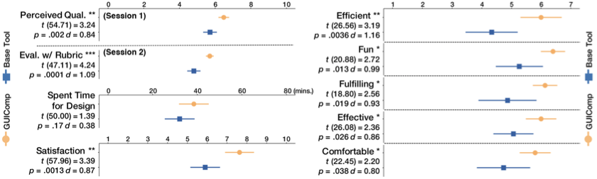
In this work, we aim to design a tool for assisting novices. To achieve this goal, we conducted semi-structured, in-depth interviews with 16 participants to understand the difficulties of mobile GUI design. Based on the difficulties observed during the interviews, we designed a tool, GUICompanion (GUIComp) by integrating three different types of feedback mechanisms: recommendation, evaluation, and attention. We designed GUIComp as a browser add-on, so that it can be easily linked to existing GUI prototyping tools. In our experiment, we linked GUIComp with a base tool, called Kakao Oven and asked 30 participants to design GUIs for user profile input and a list of products with either GUIComp or the base tool. Then we asked 47 Amazon Mechanical Turk (AMT) workers to assess the resulting designs. The results indicate that the proposed tool helped users who lacked experience in mobile GUI design to easily begin and develop a GUI design within a short period. With GUIComp, the users were able to efficiently start their designing with examples, check whether their design seemed acceptable, and produced it as they intended guided by visual complexity scores. The results also show that mobile GUIs produced with GUIComp were more acceptable designs to general users than those produced with the base tool. The participants reported that designing mobile GUIs with GUIComp was more enjoyable, satisfactory, and affordable than with the base tool. We believe that our approach to providing real-time multi-faceted feedback can be applicable to non-mobile GUI design tasks (e.g., web design).
The contributions of this work include the 1) characterization of the difficulties that users encounter while designing GUIs by conducting semi-structured interviews, 2) design and evaluation of GUIComp, an end-to-end system that integrates multi-faceted feedback for mobile GUI design and facilitates an iterative design process, and 3) lessons learned from the study and design guidelines for GUI prototyping assistance.
Related work
GUI Prototyping Tools
Many tools have been developed for GUI prototyping. Adobe Photoshop and Illustrator are popular among designers for providing many toolboxes for drawing various simple and complex shapes . Several tools have been proposed to allow easy prototyping by reducing the time for interaction and adding animation. Adobe XD , InVision , Sketch , and Principle are tools in this category. Other tools have also been proposed to allow more rapid prototyping, such as UXPin , Proto.io , and Axure , all of which are equipped with a large number of ready-made elements. Despite the helpfulness of these tools in rapid prototyping, they may not be sufficient for users, because they do not provide timely feedback on the users’ designs to improve quality.
Approaches for Assisting GUI Prototyping
Many approaches exist for assisting GUI prototyping, and they can be categorized into three groups. The first approach allows users to browse examples. Existing studies report that browsing examples inspires designers and leads to alternative designs . For example, “d.tour” proposed by Ritchie et al. allows users to search for examples by using user-provided keywords. The second approach enables users to interactively explore, extract, and use specific design elements from the examples. The extracted elements can be directly used as a template or building block in prototyping. Tsai and Chen’s framework is an early system for supporting template-based mobile user interface design. However, in this approach, users are limited in terms of which elements they can extract, such as structures, layouts, and styles. Rewire automatically converts a UI screenshot to a vector representation of design elements, which users can import into their graphic editing tools and revise for their own purposes. The third approach aims to partially or fully automate the design stages using computational methods. O’Donovan et al. develop DesignScape which provides users with various layout suggestions for refinement and brainstorming. Todi et al. propose an approach that produces familiar designs by restructuring existing layouts and an interactive layout sketching tool, which offers real-time design optimization with suggestions of local and global changes to improve the usability and aesthetics. In contrast, ReDraw and pix2code are designed to produce a code, which can be executed to create an application, generated by a convolutional neural network model based on a sample UI image. Moran et al. propose an approach that automatically checks whether the users’ design implementation follows a design guideline provided as an image. Despite their usefulness, automated approaches have several weaknesses. First, users are often excluded from the automatic design recommendation process, except for the choice of its input (e.g., an image of an example UI). In addition, an automated approach does not guarantee the high quality of its output; the quality is often delegated to users. Automated methods can also prevent users from freely envisioning creative designs constrained by their output examples, as reported in previous studies . These weaknesses can be overcome by supporting users to lead the design process, but rare studies exist on how to support. We investigate how people can lead design efforts, assisted by the machine acting as a smart companion during the process.
Metrics for Measuring Visual Complexity
Metrics for evaluating web pages and mobile GUIs already exist. Web page evaluation metrics focus on the visual complexity of websites with individual and numeric factors (e.g., word count or graphics count ), whereas those for mobile GUIs concern detailed elements that contribute to the overall visual complexity of designs, such as words, color, image counts and sizes, symmetry, balance , and layouts . There are other approaches for evaluating visual complexity of mobile GUIs . Miniukovich and Angeli propose metrics for measuring visual impressions of mobile GUIs and demonstrated that their model can explain 40% of the variation of subjective visual complexity scores. Their experiment also revealed that dominant colors and the symmetry of UIs are correlated with aesthetics, while color depth information is more correlated with visual complexity. The model is further extended to measure the visual complexity of desktop GUIs . Riegler and Holzmann propose eight visual complexity metrics for evaluating mobile GUIs. Their metrics evaluate the quality of the number of UI elements, misalignment, imbalance, density, element smallness, inconsistency, color, and typographic complexity. The metrics were mathematically formulated and evaluated through a user study. In this work, we use Riegler and Holzmann’s metrics , because they can present visual complexity in numeric values in real-time.
User Study Design
To evaluate GUIComp, we conducted a user study, in which 30 participants were asked to create two GUI designs: one with restrictions and one without. Then we presented the designs to online workers to evaluate the quality of the designs. This evaluation was guided by three primary research questions:
-
Does GUIComp help users make better designs according to general users than Kakao Oven alone?
-
Does GUIComp provide users with a more fun, fulfilling, and satisfactory experience?
-
Do users perform iterative design process to overcome the difficulties during prototyping?
Participants, Procedure, Apparatus, and Tasks
We recruited 30 participants with an advertisement at a university according to the definition of the novices in the introduction section. As participants entered the experiment room, they were asked to fill out a form on demographic and background information, including name, age, gender, major, prototyping, and development experience and time. Then, the participants were randomly assigned to either the Control Group (CG) or the Experiment Group (EG). The CG participants were allowed to use only a base GUI prototyping tool, called Kakao Oven (1 A only), whereas the EG participants were given the proposed tool and the base tool (1 A–D). We used Kakao Oven for the same reason as in the previous participatory study. We also concerned that if we used a different tool as the basis and found strange or disappointing results, we would not know if those results were due to an unsuccessful design or simply to some un-analyzed differences between the two tools. The experiment was a between-subject study to minimize learning effects and was carried out with a computer (Intel i7, 3.40GHz, 16GB RAM, 2560x1440 27-inch monitor).
At the beginning, the experimenters explained the purposes and goals of the experiment to both groups for 5 minutes. Then the participants in both groups watched the explanatory video for 5 minutes (using Kakao Oven) or 15 minutes (Kakao Oven and GUIComp, including the visual metrics explanation). We also provided concise descriptions of the visual metrics in a popup window, which the participants could mouse over to read during the study. The participants were allowed as much time as possible to familiarize themselves with the tool assigned to them, and explore the tool’s features. In addition, we told participants that 10% of them would receive an incentive (US$10), in addition to the base payment (US$20) based on the perceived quality scores rated afterward by online workers. Finally, the study began after the experimenters calibrated the eye-tracker (Eyelink 1000+, sampling rate up to 2 kHz) for the gaze transition analysis.
During the experiment, we gave the participants two tasks: a situation with design restrictions given by clients (e.g., embedding brands ) and one without any restrictions. The two tasks we used were a user profile interface with restrictions (T1) and an item-listing interface without any restrictions (T2). We chose the two interfaces as the tasks for users with little design experience, because we thought that 1) the difficulty level was appropriate, as the basic design components are provided by Kakao Oven, such as icons and buttons, and 2) the interfaces are commonly requested, given that many apps require input of user information and show items in a listing interface, regardless of the app category. Inspired by Lee et al.’s persona-based web page design , we used in T1 a persona-based GUI design with detailed restrictions. There were no other restrictions, which means the participants were allowed to customize their UIs as much as they desired in order to win the incentive.
Next, we describe the personal-based task used in the experiment as follows: A user’s name is Elaine (email address: elaine@gmail.com). Elaine has 12 notifications. There is one shipping item and two items in the shopping basket. Elaine left 31 reviews. Goal: Design a profile user interface for Elaine. Tasks and restrictions: 1) Your GUI should include basic information about Elaine. 2) You can add detailed information (e.g., order list, delivery tracking, cancellation returns, discount coupon, Service center, profile management). 3) Use the headings, text, shape, button, and pagination components of the given tool in your basic design layout. 4) Enter textual information about Elaine. 5) Choose colors for each component (optional). 6) Choose the font and font size for each text component (optional).
 style="width:80.0%" />
After completing the tasks, the participants responded to an exit survey about usability and user experience with GUIComp (RQ2), with the survey comprising items on efficiency, fulfillment, effectiveness, ease of use, ease of learning, user-friendliness, consistency, fun, and satisfaction . These items were rated by the participants on a 1–10 scale (1: “highly disagree," 10: “highly agree") for satisfaction scores, and on a seven-point Likert scale (1: “highly disagree," 7: “highly agree") for the other scores. The users also provided preference scores for each feedback panel (1: “least preferred," 7: “most preferred").
Overall, we recruited 32 participants, but two could not complete the experiment due to sudden system failures. Thus, 30 participants remained (18 men and 12 women, avg. age: 22.4, all from engineering schools, 15 users/group) and they had little or no experience (i.e., novices) but were interested in GUI design (less than a month: 6 participants, 1-3 months: 1, 3-6 months: 1, no experience: 22). 4 participants experienced a prototyping tool as their personal hobby (2: Kakao Oven, 2: Adobe Photoshop). None of the other participants had previous prototyping tool experience. We excluded the eye tracking data for 6 participants in the EG, as the data did not contain full prototyping processes due to a malfunction. Thus, we used 18 sets of eye tracker data (9 participants $`\times`$ 2 tasks) in our eye tracking-based analysis. We analyzed EG groups’ gaze data only, because we are interested in how GUIComp helps users (RQ1–RQ3).
📊 논문 시각자료 (Figures)


![]()