Title: A Data-Driven Approach for Mapping Multivariate Data to Color
ArXiv ID: 1608.05772
Date: 2016-08-23
Authors: Shenghui Cheng, Wei Xu, Wen Zhong, Klaus Mueller
📝 Abstract
A wide variety of color schemes have been devised for mapping scalar data to color. Some use the data value to index a color scale. Others assign colors to different, usually blended disjoint materials, to handle areas where materials overlap. A number of methods can map low-dimensional data to color, however, these methods do not scale to higher dimensional data. Likewise, schemes that take a more artistic approach through color mixing and the like also face limits when it comes to the number of variables they can encode. We address the challenge of mapping multivariate data to color and avoid these limitations at the same time. It is a data driven method, which first gauges the similarity of the attributes and then arranges them according to the periphery of a convex 2D color space, such as HSL. The color of a multivariate data sample is then obtained via generalized barycentric coordinate (GBC) interpolation.
💡 Deep Analysis
📄 Full Content
A Data-Driven Approach for Mapping Multivariate Data to Color
Shenghui Cheng, Wei Xu, Wen Zhong and Klaus Mueller
Visual Analytics and Imaging (VAI) Lab, Computer Science Department, Stony Brook University and Brookhaven National Lab
ABSTRACT
A wide variety of color schemes have been devised for mapping
scalar data to color. Some use the data value to index a color scale.
Others assign colors to different, usually blended disjoint
materials, to handle areas where materials overlap. A number of
methods can map low-dimensional data to color, however, these
methods do not scale to higher dimensional data. Likewise,
schemes that take a more artistic approach through color mixing
and the like also face limits when it comes to the number of
variables they can encode. We address the challenge of mapping
multivariate data to color and avoid these limitations at the same
time. It is a data driven method, which first gauges the similarity
of the attributes and then arranges them according to the periphery
of a convex 2D color space, such as HSL. The color of a
multivariate data sample is then obtained via generalized
barycentric coordinate (GBC) interpolation.
1 INTRODUCTION
Mapping data to color has a rich history and several well-tested
color schemes have emerged [1]. In this paper, we are interested
in colorizing multivariate data. Here we wish to go beyond the
bivariate and trivariate cases, where the two or three variables can
be assigned to two or three primary colors through bilinear or
barycentric interpolation respectively [3]. Our method is an
automatic and data-driven method for visually encoding
similarities of variables and data items.
2 OUR MULTIVARIATE COLOR MAPPING SCHEME
Our color scheme is a data-driven method based on the relations
of data. We first conducted the analysis to extract the similarities
or distances among data items and variables. GBC plot is a typical
way to visualize the relations among data items and variables, but
it loses accuracy. Thus we make use of the improved GBC plot
described by Cheng et al [2]. It first maps the variables at the
GBC plot periphery (the vertices of the GBC – we choose a
circular representation) and then map the data points into it. Since
this layout scheme is an optimized approach, it is able to preserve
the similarity of variables, the similarity of data points, and the
similarity of data points to variables.
We illustrate our work with 300 data samples obtained at
irregularly placed sensors in a city. Measured are heavy pollutant
chemicals, such as “As”, “Cd”, “Cr”, “Cu”, “Hg”, “Ni”, “Pb”, and
“Zn”. Fig. 1 shows a visualization of these data with our interface.
Color Space
After laying out the data, we seek to map the data to a proper
color space. Here we wish to choose a color space that can
preserve the various similarities described above. Considering the
circular shape of the GBC plot, we choose the HSL color space
(alternatively, an implementation with the HCL space is in
progress). The HSL has a double cone topology and turns into a
circle if the lightness L is fixed. This circle can be integrated into
the GBC layout. Hence, the HSL color space provides a
straightforward geometry for mapping. Using the GBC mapping
scheme for the layout, the variables can then be positioned at the
circle’s boundary and consequently the samples are laid out in the
circle’s center. As such, the layout will result in the sample’s Hue
H and Saturation S. The GBC plot directly maps to the center
slice of the HSL color space and given this direct mapping it is
straightforward to obtain the H and S values for the geospatial
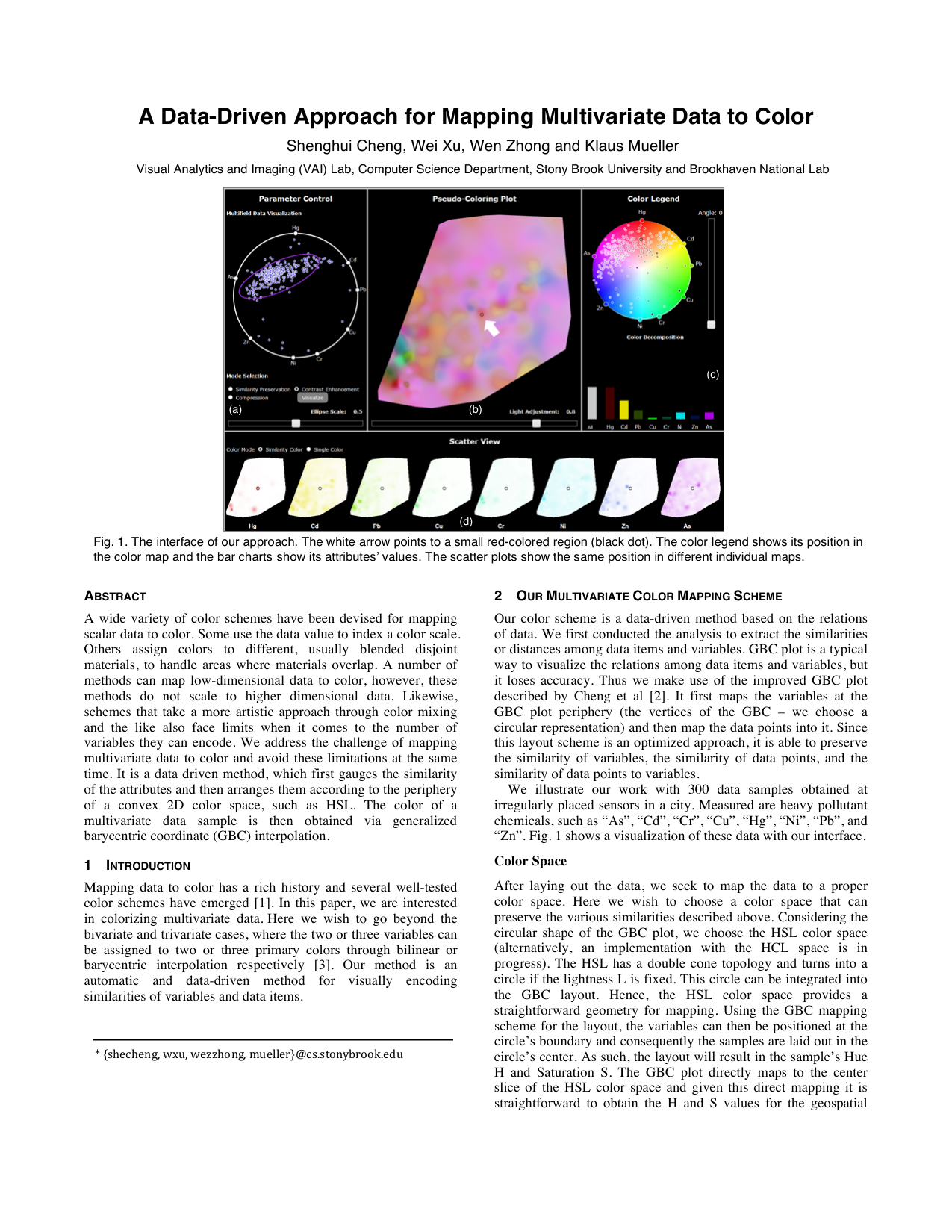
Fig. 1. The interface of our approach. The white arrow points to a small red-colored region (black dot). The color legend shows its position in
the color map and the bar charts show its attributes’ values. The scatter plots show the same position in different individual maps.
(b)
(c)
(d)
(a)
* {shecheng, wxu, wezzhong, mueller}@cs.stonybrook.edu
map colors. For the lightness, we typically choose L=0.65 for now
(Fig. 2 (a)), but we also allow users to adjust it to enhance some
features.
The GBC layout of the attributes preserves the original
similarities in the data and this feature is still maintained in the HS
space. By using the GBC plot and the HS space, we can map
similar colors to similar attributes, and vice versa. Likewise,
similar points map to similar locations in the GBC plot’s interior
(and the HS map) and thus will end up having similar colors. Due
to the similarity-based, contextual layout of data items and
variables, the GBC plot enables users to appreciate what the
dominant pollutants are. It is important to realize that the HSL
slice-based plot maps samples by the percentage of pollutants they
have, and not by absolute value. Conversely, for drawing the
colored spatial map we can map the sample weight to intensity.
After assigning colors to samples, w