Striking a Balance: Evaluating How Aggregations of Multiple Forecasts Impact Judgment Under Uncertainty
Decision-makers consult multiple forecasts to account for uncertainties when forming judgments about future events. While prior works have compared unaggregated and highly-aggregated designs for displaying multiple forecasts (e.g., Multiple Forecast Visualizations versus confidence interval plots), it remains unclear how partial aggregation impacts judgment. To investigate the effect of partial aggregation, we curated three designs that partially aggregate multiple forecasts. Through two large-scale studies (Experiment 1 n = 695 and Experiment 2 n = 389) across 14 judgment-related metrics, we observed that one design (Horizon Sampled MFV) significantly enhanced participants’ ability to predict future trends, thereby reducing their surprise when confronted with the actual outcomes. Grounded in empirical evidence, we provide insights into how to design visualizations for multiple forecasts to communicate uncertainty more effectively. Specifically, since no approach excels in all metrics, we advise choosing different designs based on communication goals and prior knowledge of forecasts.
💡 Research Summary
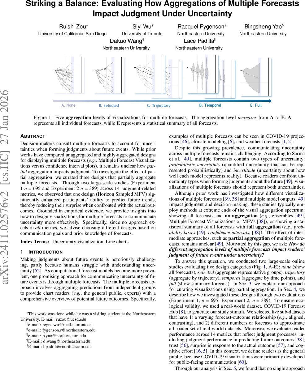
The paper investigates how different levels of aggregation in visualizing multiple forecasts affect users’ judgment under uncertainty. While prior work has contrasted two extremes—displaying all individual forecasts (Multiple Forecast Visualizations, MFVs) versus showing a fully aggregated statistical summary such as confidence‑interval plots—this study introduces and evaluates three intermediate designs that partially aggregate forecasts.
The three novel designs are:
-
Horizon Sampled MFV – Using DBSCAN clustering at the forecast horizon (the furthest time point), eight clusters are formed and one representative forecast from each cluster is displayed, yielding 6‑9 lines that preserve the overall shape and distribution while reducing over‑plotting.
-
Base Progressively Sampled MFV – DBSCAN is applied at every time step, creating clusters that capture common trajectories. Clusters are connected with straight line segments, forming a Sankey‑like diagram that visualizes how forecasts move between groups over time.
-
Frequency‑mapped Progressively Sampled MFV – Extends the base design by encoding cluster density and transition frequency with opacity and color intensity, allowing users to see at a glance where most forecasts concentrate.
To situate these designs, the authors construct a full design space of nine visualizations: (a) raw MFV (no aggregation), (b) the three partial‑aggregation designs, (c) violin and density plots (statistical aggregation per time point), (d) confidence‑interval (CI) plots (full aggregation across time and forecasts), and (e) mean‑only plots (no uncertainty shown).
Two large‑scale online experiments were conducted using real COVID‑19 Forecast Hub data. Experiment 1 involved 695 participants; Experiment 2, 389 participants. Each participant viewed one of the nine visualizations (randomly assigned) and then performed a series of tasks measuring fourteen judgment‑related metrics: objective performance (absolute error, range selection), subjective trust (multi‑item scales), surprise upon seeing the actual outcome, perceived cognitive effort, and others.
Key findings:
- Horizon Sampled MFV consistently yielded the lowest prediction error and the smallest surprise scores, indicating that a modest number of representative forecasts helps users form accurate mental models without overwhelming them.
- Confidence‑interval plots achieved the highest trust ratings, suggesting that fully aggregated summaries are perceived as more authoritative or reliable.
- Progressively Sampled designs performed moderately across metrics; the frequency‑mapped variant reduced perceived effort compared with the base version but introduced visual complexity that sometimes lowered accuracy.
- Violin and density plots conveyed distributional information but performed poorly for tasks requiring temporal trend interpretation, as they do not preserve continuity across time points.
- Mean‑only plots unsurprisingly lagged on all uncertainty‑related measures.
From these results the authors derive practical design recommendations. When the communication goal is to enable accurate future‑scenario prediction (e.g., policy planning), a Horizon Sampled MFV is advised. When the goal is to build public trust in the forecasting system, a full CI plot is preferable. For expert audiences needing to compare trajectories or understand model diversity, the progressively sampled visualizations are suitable, especially if the audience is familiar with the underlying model uncertainties. The paper also stresses that designers should consider prior knowledge about forecast incertitude: higher confidence in model accuracy justifies more aggregation; higher uncertainty calls for less aggregation to expose the range of possibilities.
Overall, the study contributes (1) three new partially aggregated visualization techniques, (2) a comprehensive empirical evaluation across a broad set of judgment metrics, and (3) actionable guidelines for selecting the appropriate level of aggregation based on communication objectives and audience expertise. The work bridges a gap in uncertainty visualization literature and opens avenues for future research in other domains (climate, finance) and for interactive extensions of the proposed designs.
Comments & Academic Discussion
Loading comments...
Leave a Comment