A Constructive Scientific Methodology to Improve Climate Figures from IPCC
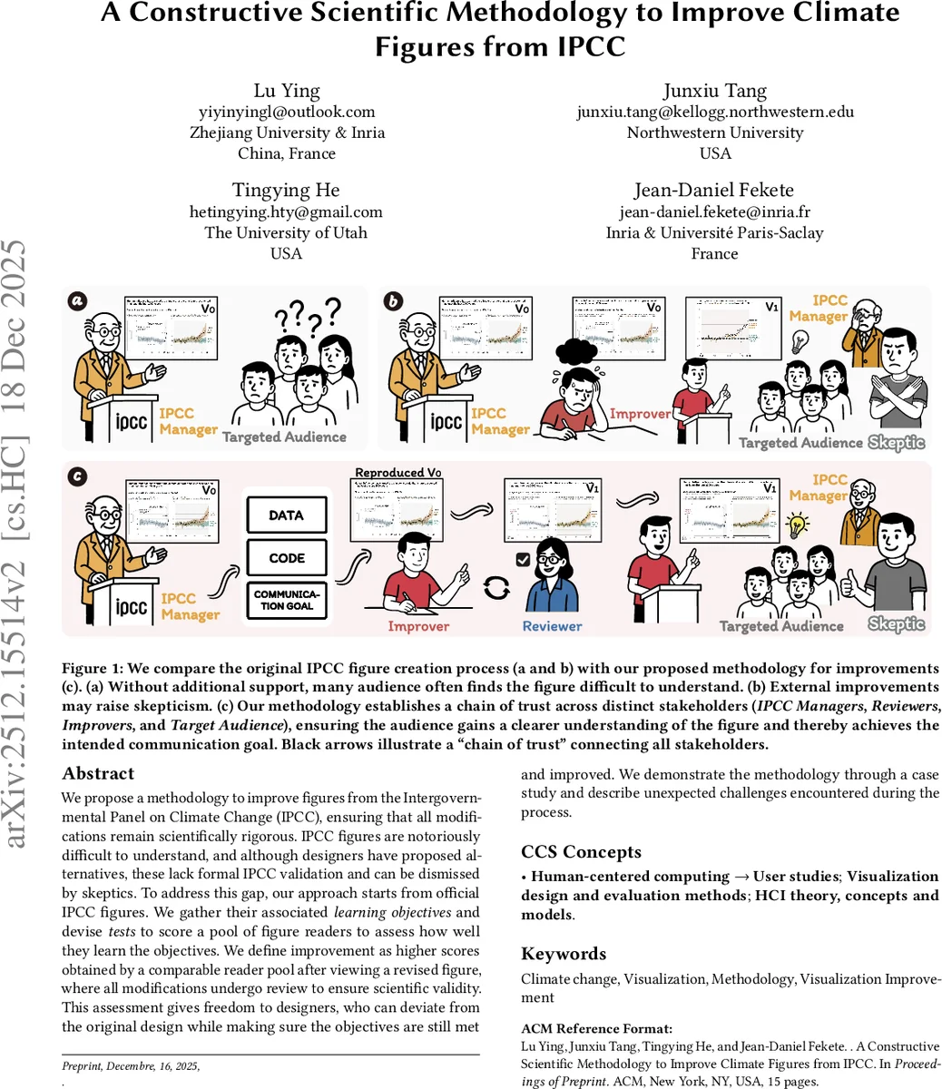
We propose a methodology to improve figures from the Intergovernmental Panel on Climate Change (IPCC), ensuring that all modifications remain scientifically rigorous. IPCC figures are notoriously difficult to understand, and although designers have proposed alternatives, these lack formal IPCC validation and can be dismissed by skeptics. To address this gap, our approach starts from official IPCC figures. We gather their associated learning objectives and devise tests to score a pool of figure readers to assess how well they learn the objectives.We define improvement as higher scores obtained by a comparable reader pool after viewing a revised figure, where all modifications undergo review to ensure scientific validity. This assessment gives freedom to designers, who can deviate from the original design while making sure the objectives are still met and improved. We demonstrate the methodology through a case study and describe unexpected challenges encountered during the process.
💡 Research Summary
The paper addresses a persistent problem in climate communication: the visual figures produced by the Intergovernmental Panel on Climate Change (IPCC) are scientifically rigorous but notoriously difficult for non‑expert audiences to understand. While external designers occasionally produce “friendlier” versions, those adaptations lack formal IPCC validation and can be dismissed as biased or inaccurate, especially by climate skeptics. To bridge this gap, the authors propose a constructive, scientifically grounded methodology that enables systematic improvement of IPCC figures while preserving their scientific fidelity.
The core of the methodology is a “learning‑objective‑based” evaluation framework. First, IPCC managers (the “IPCC Manager” role) explicitly articulate the learning objectives associated with each figure—what a viewer should be able to know, interpret, or act upon after seeing the graphic. These objectives are derived from established educational taxonomies (e.g., Bloom’s) and are documented as metadata. Next, “Improvers” (designers or visual communication specialists) create revised versions of the figure, guided solely by the stated objectives. The revision process is supported by visualization linting tools that automatically check for common visual flaws (color contrast, axis labeling, data provenance, etc.) and by a version‑controlled repository that records every change for transparency.
A separate “Reviewer” role then assesses the revised figure for scientific correctness. Reviewers are typically climate scientists who verify that the data, model outputs, and narrative explanations remain faithful to the original source, ensuring that no inadvertent distortion has been introduced. The reviewer’s report, together with the linting results, constitutes a “reproducibility stamp” that signals the figure has passed an independent quality check.
Finally, the “Target Audience” (the intended non‑expert readers) participates in a controlled user study. Two comparable reader pools are recruited; one views the original figure, the other views the revised version. Both groups complete a test suite derived directly from the learning objectives—multiple‑choice questions, short‑answer explanations, and task‑based perception challenges. Scores are compared statistically; a significant improvement in the revised‑figure group constitutes evidence that the redesign succeeded.
The authors illustrate the full pipeline with a case study from IPCC Working Group I. The original infographic combined several climate model outputs into a dense, multi‑layered diagram that most lay readers could not decode. The Improver simplified the layout, highlighted key temperature trajectories, and adopted a color‑blind‑friendly palette. The Reviewer confirmed that all underlying data and model references were unchanged. In the user test, the revised figure yielded an 18 % higher average score on the learning‑objective test, demonstrating a measurable gain in comprehension.
During implementation the authors encountered three unexpected challenges. (1) IPCC internal processes rarely formalize learning objectives, so extracting clear goals required extensive workshops with scientists and communication staff. (2) Reviewers sometimes struggled to balance scientific verification with design critique, leading to role‑conflict; the authors recommend splitting the reviewer role into a “Scientific Reviewer” and a “Design Reviewer.” (3) The composition of the target audience proved critical—differences in education level, cultural background, and prior climate knowledge produced variability in test results, suggesting that audience segmentation and multilingual pilots are essential for robust evaluation.
Key contributions of the paper are:
- A novel, reproducible workflow that links scientific authority (IPCC managers), design expertise (Improvers), independent verification (Reviewers), and end‑user comprehension (Target Audience) through a transparent “chain of trust.”
- An operationalization of learning objectives as measurable test items, enabling quantitative assessment of visual communication effectiveness.
- Empirical evidence from a real IPCC figure that the methodology can produce statistically significant improvements without compromising scientific integrity.
- A discussion of practical obstacles and concrete recommendations for scaling the approach to other IPCC Working Groups, future Assessment Reports, and analogous bodies such as the Intergovernmental Science‑Policy Platform on Biodiversity and Ecosystem Services (IPBES).
In conclusion, the paper provides the first comprehensive, scientifically validated framework for improving climate‑change visualizations in high‑stakes policy documents. By embedding reproducibility stamps, automated linting, and objective learning‑outcome testing, the approach offers a scalable path for international scientific agencies to make their data visualizations both trustworthy and accessible to the broader public.
Comments & Academic Discussion
Loading comments...
Leave a Comment