The Language of Infographics: Toward Understanding Conceptual Metaphor Use in Scientific Storytelling
We apply an approach from cognitive linguistics by mapping Conceptual Metaphor Theory (CMT) to the visualization domain to address patterns of visual conceptual metaphors that are often used in science infographics. Metaphors play an essential part in visual communication and are frequently employed to explain complex concepts. However, their use is often based on intuition, rather than following a formal process. At present, we lack tools and language for understanding and describing metaphor use in visualization to the extent where taxonomy and grammar could guide the creation of visual components, e.g., infographics. Our classification of the visual conceptual mappings within scientific representations is based on the breakdown of visual components in existing scientific infographics. We demonstrate the development of this mapping through a detailed analysis of data collected from four domains (biomedicine, climate, space, and anthropology) that represent a diverse range of visual conceptual metaphors used in the visual communication of science. This work allows us to identify patterns of visual conceptual metaphor use within the domains, resolve ambiguities about why specific conceptual metaphors are used, and develop a better overall understanding of visual metaphor use in scientific infographics. Our analysis shows that ontological and orientational conceptual metaphors are the most widely applied to translate complex scientific concepts. To support our findings we developed a visual exploratory tool based on the collected database that places the individual infographics on a spatio-temporal scale and illustrates the breakdown of visual conceptual metaphors.
💡 Research Summary
**
The paper “The Language of Infographics: Toward Understanding Conceptual Metaphor Use in Scientific Storytelling” bridges cognitive linguistics and data visualization by applying Conceptual Metaphor Theory (CMT) to the analysis of scientific infographics. The authors argue that visual metaphors are central to communicating complex scientific ideas, yet their creation is often guided by intuition rather than a systematic framework. To address this gap, they develop a taxonomy that classifies visual conceptual metaphors into four CMT‑derived categories: imagistic, orientational, ontological, and structural.
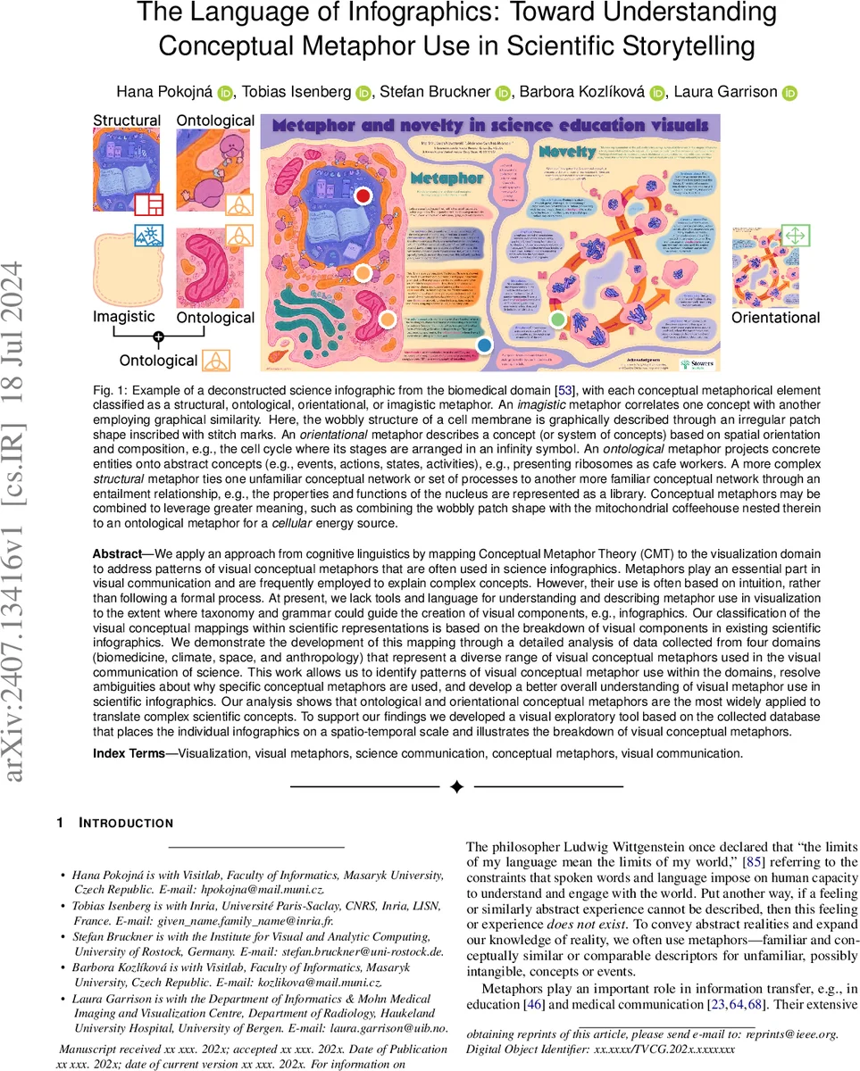
Imagistic metaphors rely on visual similarity (e.g., a wavy patch to suggest a cell membrane) and convey only superficial appearance. Orientational metaphors map spatial arrangement or direction to abstract properties such as cyclicality, positivity/negativity, or temporal flow (e.g., stages of the cell cycle placed on an infinity symbol). Ontological metaphors project concrete entities onto abstract concepts, often through personification or color semantics (e.g., ribosomes depicted as café workers, red indicating urgency). Structural metaphors are the most complex, aligning an entire network of source concepts with a target network, thereby transferring an entire set of relations and processes (e.g., a cell nucleus visualized as a library).
Methodologically, the study adapts the linguistic Method for Identifying Metaphorically Used Words (MIP) to visual elements. Four scientific domains—biomedicine, climate science, space exploration, and anthropology—were sampled from scholarly publications and popular‑science outlets, yielding 304 infographics (≈70–80 per domain). Two domain experts independently coded each visual component, achieving a Cohen’s κ of 0.78, indicating strong inter‑rater reliability.
Quantitative analysis shows that ontological metaphors appear in 62 % of the infographics and orientational metaphors in 55 %, making them the most prevalent types. Structural metaphors occur in 28 % and imagistic in 21 %. Domain‑specific patterns emerge: biomedical graphics frequently combine ontological and structural metaphors (e.g., “cell nucleus as a library” with “mitochondria as a coffee shop”), climate graphics favor orientational metaphors to depict cycles and trends (e.g., temperature trends rendered as a clock), space graphics use structural metaphors to map orbital mechanics onto familiar transportation networks, and anthropology graphics employ ontological personifications to illustrate cultural exchange.
A notable contribution is the identification of metaphor‑combination strategies. The authors illustrate how layering an imagistic metaphor (irregular patch) with an ontological metaphor (café workers) creates a richer, more cognitively efficient representation of cellular energy production. Such combinations reduce cognitive load by linking new information to multiple pre‑existing schemas, thereby improving comprehension and retention.
To make the taxonomy actionable, the authors built an interactive visual exploration tool. The tool visualizes the corpus on a spatio‑temporal axis, allowing users to filter by domain, year, or metaphor type, and to observe trends such as the rise of ontological metaphors in climate graphics over the past decade. This resource serves both designers—who can consult the database for evidence‑based metaphor choices—and educators, who can use the visualizations as teaching examples.
The paper’s contributions are threefold: (1) a rigorously defined CMT‑based classification of visual metaphors for scientific infographics; (2) a large, cross‑domain annotated dataset that quantifies metaphor usage patterns; (3) an exploratory interface that operationalizes the taxonomy for design and research.
Limitations include the exclusive focus on English‑language, Western‑centric infographics, which may overlook culturally specific metaphor conventions. The study also lacks an empirical evaluation of how identified metaphors affect learning outcomes; user studies with eye‑tracking or recall tests would strengthen claims about cognitive efficiency. Finally, the current workflow depends on manual coding; future work could explore automated detection of visual metaphors using computer vision and natural language processing.
Future directions suggested are (a) expanding the corpus to non‑Western languages and cultures, (b) conducting controlled experiments to measure the pedagogical impact of different metaphor types, and (c) integrating the taxonomy with design tools to provide real‑time metaphor recommendations during infographic creation. By grounding visual storytelling in a well‑established linguistic theory, the paper opens a pathway toward more intentional, effective, and analytically tractable scientific communication.
Comments & Academic Discussion
Loading comments...
Leave a Comment