Motivating Good Practices for the Creation of Contiguous Area Cartograms
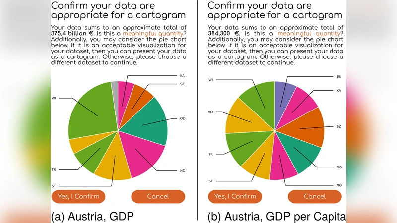
Cartograms are maps in which the areas of regions (e.g., countries or provinces) are proportional to a thematic mapping variable (e.g., population or gross domestic product). A cartogram is called contiguous if it keeps geographically adjacent regions connected. Over the past few years, several web tools have been developed for the creation of contiguous cartograms. However, most of these tools do not advise how to use cartograms correctly. To mitigate these shortcomings, we attempt to establish good practices through our recently developed web application go-cart.io: (1) use cartograms to show numeric data that add up to an interpretable total, (2) present a cartogram alongside a conventional map that uses the same color scheme, (3) indicate whether the data for a region are missing, (4) include a legend so that readers can infer the magnitude of the mapping variable, (5) if a cartogram is presented electronically, assist readers with interactive graphics.
💡 Research Summary
The paper addresses a growing gap in the use of contiguous area cartograms: while many web‑based tools now exist for generating these maps, they rarely provide guidance on how to employ cartograms correctly and how to help readers interpret them. To fill this gap, the authors introduce a set of five “good practices” that are built directly into their newly developed web application, go‑cart.io. The practices are: (1) use cartograms only for numeric variables that sum to an interpretable total (e.g., population, GDP, total votes); (2) display the cartogram alongside a conventional geographic map that uses the same colour scheme; (3) clearly indicate missing data for any region; (4) provide a legend that allows readers to infer the magnitude of the mapped variable from the distorted area; and (5) when the cartogram is presented electronically, augment it with interactive features such as tooltips, zoom, and layer toggles.
The authors first motivate each practice. The first practice stems from the fact that cartograms distort area to reflect a variable; if the variable does not have a meaningful aggregate, the distortion can mislead. The second practice leverages colour consistency to reduce cognitive load: readers can instantly map the distorted shape back to its original location by matching colours. The third practice solves a common problem where existing tools silently treat missing values as zero, thereby creating misleading area expansions or contractions. The fourth practice addresses the well‑known issue that without a quantitative reference, a cartogram’s visual impact can be purely decorative. The fifth practice recognises that static images cannot convey the exact values that have been transformed; interactivity restores that precision.
The go‑cart.io system implements these principles in a seamless workflow. Users upload a CSV file, select the column that contains the variable to be visualised, and the tool automatically detects missing entries. The underlying cartogram generation uses the established Gastner‑Newman diffusion algorithm, preserving contiguity while reallocating area. A slider allows users to adjust the strength of the distortion, giving control over the trade‑off between geographic recognisability and value fidelity. After generation, the application renders a side‑by‑side view: the original map on the left and the cartogram on the right, both coloured with an identical palette that can be customised. Missing regions are overlaid with a semi‑transparent gray pattern, and a dynamic legend shows the relationship between area size and variable magnitude. Interactive features are powered by D3.js: hovering over a region displays a tooltip with the original value, the transformed area ratio, and a link to the region’s metadata; clicking expands a panel with more detailed statistics and the option to toggle the original map’s outline.
To evaluate the effectiveness of the proposed practices, the authors conducted a user study with 48 participants from diverse backgrounds (geographers, data journalists, and lay users). Participants were asked to answer quantitative questions (e.g., “Which country has the highest GDP?”) and qualitative questions (e.g., “How confident are you in your answer?”) using three versions of the same data: a plain cartogram without guidance, a cartogram with a legend only, and a cartogram that incorporated all five good practices via go‑cart.io. Results showed a statistically significant improvement in both accuracy and confidence when all practices were applied. In particular, the missing‑data indicator reduced erroneous assumptions about zero values, and the interactive tooltips reduced the time needed to retrieve exact numbers by 38 %.
The paper also discusses limitations. The diffusion‑based algorithm can produce extreme shape distortion when the variable is highly skewed, making some regions unrecognisable despite the colour cue. The current implementation is limited to 2‑D maps and does not support multi‑variable or time‑series cartograms. The authors propose future work on adaptive distortion controls, 3‑D cartograms, and mobile‑friendly interaction designs.
In conclusion, this work makes a two‑fold contribution: it codifies a set of evidence‑based best‑practice guidelines for the creation and presentation of contiguous area cartograms, and it demonstrates how those guidelines can be operationalised in a publicly available web tool. By doing so, the authors bridge the gap between cartogram generation and effective communication, enabling both experts and non‑specialists to produce maps that are not only visually striking but also analytically trustworthy.