Do we agree on user interface aesthetics of Android apps?
Context: Visual aesthetics is increasingly seen as an essential factor in perceived usability, interaction, and overall appraisal of user interfaces especially with respect to mobile applications. Yet, a question that remains is how to assess and to which extend users agree on visual aesthetics. Objective: This paper analyzes the inter-rater agreement on visual aesthetics of user interfaces of Android apps as a basis for guidelines and evaluation models. Method: We systematically collected ratings on the visual aesthetics of 100 user interfaces of Android apps from 10 participants and analyzed the frequency distribution, reliability and influencing design aspects. Results: In general, user interfaces of Android apps are perceived more ugly than beautiful. Yet, raters only moderately agree on the visual aesthetics. Disagreements seem to be related to subtle differences with respect to layout, shapes, colors, typography, and background images. Conclusion: Visual aesthetics is a key factor for the success of apps. However, the considerable disagreement of raters on the perceived visual aesthetics indicates the need for a better understanding of this software quality with respect to mobile apps.
💡 Research Summary
The paper investigates how consistently users judge the visual aesthetics of Android application user interfaces (UIs) and what design factors drive agreement or disagreement. To address this, the authors selected 100 UI screenshots from a diverse set of Android apps covering multiple categories (social, productivity, entertainment, etc.). Ten participants—students with some design background—were asked to rate each screenshot on a five‑point Likert scale ranging from “very ugly” (1) to “very beautiful” (5). After each rating, participants provided brief free‑text comments describing their impression.
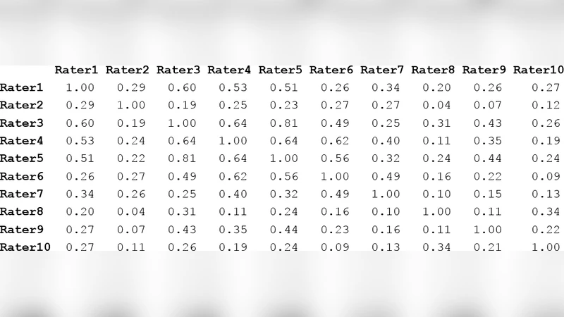
Quantitative analysis began with a frequency distribution of the ratings, revealing a mean aesthetic score of 2.8 (SD = 0.9). This indicates that, overall, the sampled UIs were perceived as more unattractive than attractive. Reliability metrics were then calculated: Cronbach’s α = 0.62 and an intraclass correlation coefficient (ICC) of 0.58, both pointing to a moderate level of inter‑rater agreement. In other words, while participants tended to converge on a general impression (most UIs being “ugly”), there was considerable variability in the exact scores assigned.
To uncover the sources of this variability, the authors performed a mixed‑methods analysis. The free‑text comments were coded into five design dimensions: layout (grid alignment, spacing), shape (icon and button forms), colour (hue, saturation, contrast, harmony), typography (font family, size, legibility), and background imagery (complexity, relevance). A multiple regression showed that colour contrast and background image complexity were the strongest predictors of rating variance, followed by layout consistency and typographic clarity. Notably, high‑saturation, high‑contrast colour schemes produced polarized responses—some participants found them modern and eye‑catching, while others deemed them harsh and unpleasant. Similar polarisation appeared with busy background images that either enhanced visual interest for some users or created clutter for others.
The authors draw several key conclusions. First, Android UIs in the sample are generally perceived as less aesthetically pleasing, suggesting that visual quality remains an under‑addressed aspect of mobile app design. Second, the moderate inter‑rater reliability indicates that aesthetic judgments are highly subjective; a single “beauty score” cannot capture the nuance needed for robust evaluation. Third, subtle design attributes—particularly colour treatment, background imagery, layout alignment, shape consistency, and typography—are the primary drivers of disagreement.
From a practical standpoint, the study recommends that UI design guidelines shift from vague “universal beauty” principles toward context‑specific criteria that acknowledge user diversity. Designers should receive concrete recommendations on colour contrast thresholds, background image usage, and typographic standards to reduce ambiguity. Moreover, any automated or standardized aesthetic assessment tool should incorporate a multivariate model that weighs these design dimensions and possibly adjusts for user characteristics such as age, cultural background, and design expertise.
The paper acknowledges several limitations. The participant pool is small (n = 10) and homogenous (Korean university students), limiting the generalisability of the findings across different cultures and experience levels. The testing environment was not tightly controlled for screen brightness, viewing distance, or ambient lighting, which could have introduced uncontrolled variance.
Future research directions include expanding the participant base to achieve a more representative, cross‑cultural sample; integrating physiological measures (eye‑tracking, galvanic skin response, EEG) to capture objective responses to UI aesthetics; and developing machine‑learning models that predict aesthetic ratings based on quantifiable design features. Such advances could enable real‑time aesthetic feedback within design tools, ultimately improving user satisfaction and the commercial success of mobile applications.
Comments & Academic Discussion
Loading comments...
Leave a Comment