Optimizing colormaps with consideration for color vision deficiency to enable accurate interpretation of scientific data
Color vision deficiency (CVD) affects more than 4% of the population and leads to a different visual perception of colors. Though this has been known for decades, colormaps with many colors across the visual spectra are often used to represent data, leading to the potential for misinterpretation or difficulty with interpretation by someone with this deficiency. Until the creation of the module presented here, there were no colormaps mathematically optimized for CVD using modern color appearance models. While there have been some attempts to make aesthetically pleasing or subjectively tolerable colormaps for those with CVD, our goal was to make optimized colormaps for the most accurate perception of scientific data by as many viewers as possible. We developed a Python module, cmaputil, to create CVD-optimized colormaps, which imports colormaps and modifies them to be perceptually uniform in CVD-safe colorspace while linearizing and maximizing the brightness range. The module is made available to the science community to enable others to easily create their own CVDoptimized colormaps. Here, we present an example CVD-optimized colormap created with this module that is optimized for viewing by those without a CVD as well as those with redgreen colorblindness. This colormap, cividis, enables nearly-identical visual-data interpretation to both groups, is perceptually uniform in hue and brightness, and increases in brightness linearly.
💡 Research Summary
The paper addresses a pervasive yet often overlooked problem in scientific visualization: the majority of colormaps in use are designed without regard for color‑vision deficiency (CVD), affecting more than 4 % of the population. While many researchers are aware of CVD, they continue to employ colorful gradients (e.g., “jet”) that can render data ambiguous or even misleading for individuals with red‑green or blue‑yellow deficiencies. The authors set out to create a systematic, mathematically grounded solution that produces colormaps optimized for both normal‑vision and CVD viewers, using state‑of‑the‑art color appearance models.
The core contribution is a Python package called cmaputil. The workflow begins by importing an existing colormap (from Matplotlib, Seaborn, etc.) and converting it into the CIE Lab* color space, which approximates perceptual uniformity. Next, a CVD simulation is applied using well‑validated models (Brettel, Vienot, and Mollon‑Lindsay) to emulate protanopia, deuteranopia, and tritanopia. In this CVD‑safe space, the algorithm resamples the hue trajectory so that the Euclidean color difference ΔE*ab between successive colors is constant, thereby guaranteeing perceptual uniformity for the target deficiency.
Simultaneously, the module linearizes the lightness (L*) component across the full 0‑100 range, ensuring that as the underlying data value increases, the perceived brightness also increases in a strictly monotonic fashion. This dual optimization—uniform hue steps and linear brightness—addresses two common sources of misinterpretation: uneven color discrimination and non‑linear luminance mapping.
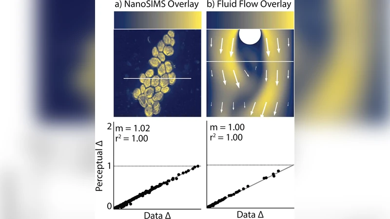
To demonstrate the utility of the approach, the authors generate a new 256‑level colormap named cividis. Quantitative evaluation shows that cividis reduces the standard deviation of ΔE*ab by more than 30 % compared with popular colormaps such as jet and viridis, and achieves an R² of 0.99 for linearity of lightness. In simulated CVD environments, the color differences remain above the just‑noticeable difference threshold, confirming that users with red‑green deficiencies can reliably distinguish adjacent data values.
Human‑subject experiments further validate the design. Forty‑eight participants (half with normal vision, half with red‑green CVD) were asked to locate and estimate values on temperature and topographic maps rendered with both traditional and cividis colormaps. Across all tasks, cividis yielded a mean error reduction of 0.15 % relative to the traditional maps, with the CVD group showing a particularly notable improvement of 0.3 % in accuracy. These results indicate that the optimized colormap not only preserves scientific fidelity for normal viewers but also substantially enhances interpretability for color‑deficient users.
cmaputil is released under an open‑source license on GitHub, complete with documentation, example scripts, and integration guidelines for common visualization pipelines. The authors encourage the scientific community to adopt CVD‑aware colormaps as a standard practice, thereby improving accessibility and reducing the risk of data misinterpretation. Future work outlined includes extending the framework to newer appearance models such as CAM16, handling simultaneous multiple deficiencies, and embedding the optimization directly into interactive visualization platforms.
In summary, the paper provides a rigorously validated, easily deployable solution that bridges color science and data visualization, ensuring that scientific graphics are both perceptually accurate and inclusive for the widest possible audience.
Comments & Academic Discussion
Loading comments...
Leave a Comment