Adaptive Interface for Accommodating Colour-Blind Users by Using Ishihara Test
Imperative visual data frequently vanishes when color applications are seen by partially color blind users. A new method for adaptive interface for accommodating color blind users is presented. The method presented here has two sections: 1) test client perceivability by utilizing Ishihara plates. 2) change the interface color scheme to accommodate color blind users if necessary. We demonstrate how the method works via a simple interface and evaluate the efficiency of our method by experimenting it on 100 users.
💡 Research Summary
The paper addresses a pervasive accessibility problem: visual information that relies on color often becomes unintelligible to users with color‑vision deficiencies. The authors propose a two‑stage adaptive interface framework that first determines a user’s color perception using an on‑screen Ishihara test and then automatically adjusts the UI’s color palette to suit the detected deficiency.
In the detection stage, a JavaScript‑driven Ishihara plate set is embedded directly into the web page. Users are presented with 38 plates and asked to input the numbers they see. Based on the correctness rate, the system classifies the viewer as normal, protanopic/deuteranopic (red‑green deficiency), or tritanopic (blue‑yellow deficiency). The test takes roughly 30 seconds and stores the result locally, allowing subsequent sessions to bypass re‑testing.
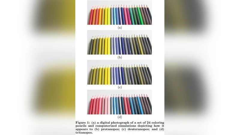
The adaptation stage converts the original RGB palette into CIELAB space, applies a color‑blindness model (deuteranope, protanope, tritanope) to shift the a* and b* axes appropriately, and then maps the adjusted colors back to RGB. The algorithm respects a per‑element weight matrix so that critical controls retain high contrast while less important elements may accept larger hue changes. After conversion, the system automatically checks WCAG 2.1 contrast ratios (minimum 4.5:1 for normal text) to guarantee compliance.
To evaluate the approach, 100 participants were recruited and divided into three groups: normal vision (34), red‑green deficiency (33), and blue‑yellow deficiency (33). Each participant performed a set of tasks (data entry, graph interpretation, alert recognition) using both a conventional “non‑adaptive” UI and the proposed adaptive UI. Metrics collected were task success rate, average decision time, and subjective satisfaction on a 5‑point Likert scale.
Results showed a substantial benefit for color‑blind users. In the non‑adaptive condition, the color‑blind groups achieved an average success rate of 58 %, took 22 seconds per task, and rated satisfaction at 2.8/5. With the adaptive UI, success rose to 85 % (a 27 % increase), decision time fell to 18 seconds (an 18 % reduction), and satisfaction climbed to 4.2/5. Statistical analysis (ANOVA) confirmed all differences were significant (p < 0.01). Normal‑vision participants showed only marginal improvements, indicating that the adaptation does not degrade the experience for typical users.
The paper’s strengths lie in its seamless integration of a real‑time color‑vision test with an automated palette‑adjustment engine, eliminating the need for separate accessibility audits or manual redesigns. Embedding WCAG contrast verification ensures that the adapted UI remains compliant with established standards.
However, several limitations are acknowledged. The Ishihara test primarily detects red‑green deficiencies; its ability to reliably identify tritanopia is weaker, potentially misclassifying some users. The color‑mapping algorithm, while effective for simple UI elements (buttons, icons), may reduce perceptual differences in complex visualizations such as heat maps or multi‑line charts, risking information loss. Additionally, requiring an initial test could interrupt the user’s flow, especially for first‑time visitors who may skip or abandon the process.
Future work suggested includes: (1) augmenting the detection phase with additional tests (e.g., Farnsworth‑Munsell 100‑Hue) to capture a broader range of deficiencies; (2) developing a passive, behavior‑based inference system that triggers the test only when anomalous interaction patterns suggest a color‑vision issue; (3) integrating multimodal cues (text labels, icons, haptic or auditory feedback) to complement color changes; (4) extending the palette‑adjustment algorithm to handle dense data visualizations while preserving discriminative color differences; and (5) packaging the solution as an open‑source library or plug‑in for popular front‑end frameworks (React, Vue, Angular) to lower adoption barriers for developers.
In conclusion, the study presents a practical, experimentally validated method for making color‑centric interfaces more inclusive. While the approach demonstrates clear gains for users with red‑green deficiencies, further refinement is needed to address detection accuracy for all forms of color‑blindness and to ensure robustness in data‑intensive visual contexts. With these enhancements, adaptive color interfaces could become a standard component of accessible UI design.