Embedding Projector: Interactive Visualization and Interpretation of Embeddings
Embeddings are ubiquitous in machine learning, appearing in recommender systems, NLP, and many other applications. Researchers and developers often need to explore the properties of a specific embedding, and one way to analyze embeddings is to visual…
Authors: Daniel Smilkov, Nikhil Thorat, Charles Nicholson
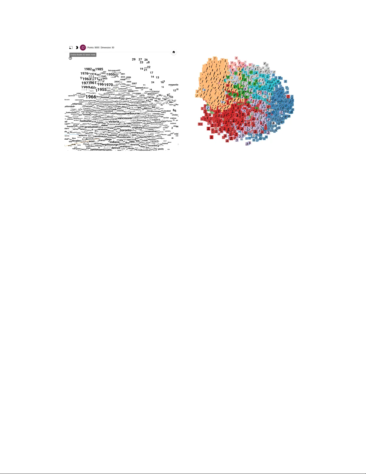
Embedding Pr ojector: Interactiv e V isualization and Interpr etation of Embeddings Daniel Smilkov Google Brain smilkov@google.com Nikhil Thorat Google Brain nsthorat@google.com Charles Nicholson Google Brain nicholsonc@google.com Emily Reif Brown Uni versity ereif@cs.brown.edu Fer nanda B. V iégas Google Brain viegas@google.com Martin W attenberg Google Brain wattenberg@google.com Abstract Embeddings are ubiquitous in machine learning, appearing in recommender sys- tems, NLP , and many other applications. Researchers and dev elopers often need to explore the properties of a specific embedding, and one w ay to analyze embeddings is to visualize them. W e present the Embedding Projector , a tool for interactive visualization and interpretation of embeddings. 1 Introduction An embedding is a map from input data to points in Euclidean space. Machine learning researchers and de velopers often need to explore the properties of a specific embedding to understand the beha vior of their model. An engineer who creates an embedding of songs for a recommendation system might want to v erify that the nearest neighbors of "Stairway to Heav en" include "Whole Lotta Lo ve" and not "Let It Go" from Frozen. Meanwhile, a researcher may be interested in global geometric properties, such as linear relationships between meaningful subsets of embedded points. For both sets of users, gaining an understanding of embedding geometry is a key step in interpreting a machine learning model. An appealing approach to analyzing embeddings is to visualize them. Since embeddings often exist in a space of hundreds of dimensions, an essential step is "dimensionality reduction" which projects points to a more approachable tw o or three dimensions. Many tools exist to perform v arious types of dimensionality reduction, b ut they are largely non-interactive (e.g., Matplotlib [3], or the code released in [5]). Unfortunately , these static vie ws are generally inadequate for e xploring high-dimensional data– although an important first step in the process, users then typically want to switch quickly between many vie ws, zooming and filtering, and then closely inspecting details. Indeed, there have been many toolkits created with the express purpose of e xploring high-dimensional data (e.g., [2], [8]), and a ke y lesson has been that rich interactivity coupled with multiple link ed vie ws is extremely helpful. At the same time, the embeddings that arise in machine learning dif fer from the kind of data sets seen in con ventional "high-dimensional" visualization. Most notably , traditional systems often assume the underlying dimensions ha ve a particular meaning (the expression le v el of a gi ven gene, or the age of a person). On the other hand, the basis v ectors in a typical embedding are typically not meaningful–in fact, discov ering semantically significant directions can be a goal in itself. In this paper , we present the Embedding Projector , a system for interactiv e visualization and analysis of high-dimensional data. Although designed to be a general-purpose tool, it is optimized for the use 30th Conference on Neural Information Processing Systems (NIPS 2016), Barcelona, Spain. cases that arise in machine learning and includes special features to e xplore meaningful directions in a data set. 2 How Users (W ant to) Interpret Embeddings W e held informal intervie ws with engineers and researchers within our organization to learn ho w they worked (or wanted to w ork) with embeddings. W e also look ed at usage of existing internal tools. Three themes arose consistently . T ask 1. Exploring local neighborhoods Many users wanted to inspect the nearest neighbors of a giv en point. Confirming that nearby points are semantically related represented an important step in establishing trust in an algorithm. T ask 2. Viewing global geometry and finding clusters Sev eral users were interested in finding large clusters of related points, as well as seeing the global geometry of the embeddings. T ask 3. Finding meaningful "directions" Researchers hav e found that embedding spaces some- times contain semantically significant directions. For example [6] disco vered that the vector defined by subtracting the point for "man" from the point for "woman" represented a kind of "female" direction in space. Users we talked with considered the discov ery of such directions interesting and worthwhile. W e kno w of no current tools that help with this use case. 3 The Embedding Projector A pplication The Embedding Projector is a web application, a v ailable as both a standalone tool and inte grated into the T ensorFlo w platform [1]. Users may either upload arbitrary high-dimensional data, in a simple text format, or (in T ensorFlow) take adv antage of the model checkpoint system that makes it easy to visualize any tensors as an embedding. Figure 1: A PCA projection of a corpus of 35k frequently used phrases in emails [4]. Fig. 1 sho ws the main vie w of the web app with (a) data panel on the left, where users can choose data columns to color and label points, (b) the pr ojected view in the center, and (c) the inspector panel on the right side, where users can search for particular points and see a list of nearest neighbors. The Embedding Projector offers three methods of reducing the dimensionality of a data set: two linear and one nonlinear . Each method can be used to create either a two- or three-dimensional view . 2 Principal Component Analysis A straightforward technique for reducing dimensions is Principal Component Analysis (PCA). The Embedding Projector computes the top 10 principal components. Menus let the user project those components onto an y combination of two or three. PCA is often effecti ve at supporting T ask 2, e xamining global geometry . t-SNE A popular non-linear dimensionality reduction technique is t-SNE [5]. The Embedding Projector of fers both two- and three-dimensional t-SNE views. Layout is performed client-side. Because t-SNE often preserves some local structure, in practice it supports both T ask 1 and T ask 2. Custom Users can construct specialized linear projections based on text searches, supporting T ask 3, finding meaningful directions in space. T o define a projection axis, the user enters two search strings or regular expressions. The program computes the centroids of the sets of points whose labels match these searches, and uses the difference v ector between centroids as a projection axis. For example, in the Smart Reply data [4], this vie w uncovered a surprisingly re gular relationship between phrases ending in periods versus e xclamation points. 3.1 Interacting with the visualizations T o explore a data set, users can navigate the vie ws in either a 2D or a 3D mode, zooming, rotating, and panning using natural click-and-drag gestures. T o help interpretation of the 3D mode, the Projector uses multiple redundant depth cues: changing the size of points based on distance to camera; adding fog to fade out more distant points; and initializing the vie w with an animated "lazy susan" motion. Both modes exploit W ebGL to provide smooth, fluid interaction, which encourages e xploration of the underlying space, supporting both T ask 1 and T ask 2. T o support T ask 1, clicking on a point causes the right pane to sho w an explicit te xtual list of nearest neighbors, along with distances to the current point. The nearest-neighbor points themselves are highlighted on the projection. Users sometimes wish to focus on a subset of points–an interesting cluster , or perhaps the set of nearest neighbors of a giv en point. Zooming into the cluster giv es some information, but it is sometimes more helpful to restrict the view to a subset of points and perform t-SNE or PCA only on those points. T o do so, the user can select points in multiple ways: after clicking on a point, its nearest neighbors are selected; after a search, the points matching the query are selected; right-clicking and dragging defines a selection sphere. After selecting a set of points, the user can isolate those points for further analysis on their o wn with the "Isolate Points" b utton in the Inspector pane on the right hand side. In 3D mode, labels can appear as "billboards" – flat images that alw ays face the user . Fig. 2 depicts this vie w . When there is an image associated with a data point, we can simply use the actual image as the "label". A nice example is an embedding of MNIST images sho wn in Fig. 3 where each image has a background color according to its true label. Collaborative Features Early in the development process we saw that users of the Embedding Projector wanted to share specific views of their data. Indeed, previous work in visualization has shown the benefits of allo wing users to share the state of a visualization [7]. T o allo w easy collaboration, the Embedding Projector lets users sa ve the current state (including computed coordinates of t-SNE embeddings) as a small file. The Projector can then be pointed to a set of one or more of these files, producing the panel seen in the bottom right of Fig. 1. Other users can then walk through a sequence of bookmarks. 4 Conclusion The Embedding Projector is a new visualization tool that helps users interpret machine learning models that rely on embeddings. Unlike other high-dimensional visualization systems, it is customized for the kinds of tasks faced by machine learning de velopers and researchers: exploring local neighborhoods for individual points, analyzing global geometry , and in vestigating semantically meaningful vectors in embedding space. The Projector is part of the T ensorFlo w platform, and seamlessly allows analysis and interpretation of T ensorFlo w models. 3 Figure 2: 3D labels view of word embeddings. Figure 3: Image view of the MNIST dataset. There are a number of directions for future work on the visualization. For example, when dev eloping multiple versions of a model, or inspecting how a model changes over time, it could be useful to visually compare tw o embeddings. Doing so w ould require nontri vial additions to the current visualizations. A second direction for future research is to make it easier for users to discov er meaningful directions in the data. While the current interface makes it easy to e xplore various hypotheses, there may be ways for the computer to generate and test hypotheses automatically . Acknowledgments Thanks to Shan Carter for in valuable design contributions, and to our colleagues who pro vided thoughtful feedback. References [1] M. Abadi, A. Agarwal, P . Barham, E. Brevdo, Z. Chen, C. Citro, G. S. Corrado, A. Davis, J. Dean, M. Devin, et al. T ensorflow: Large-scale machine learning on heterogeneous distributed systems. arXiv preprint arXiv:1603.04467 , 2016. [2] C. Ahlberg and B. Shneiderman. V isual information seeking: T ight coupling of dynamic query filters with starfield displays. In Pr oceedings of the SIGCHI conference on Human factors in computing systems , pages 313–317. A CM, 1994. [3] J. D. Hunter et al. Matplotlib: A 2d graphics environment. Computing in science and engineering , 9(3):90–95, 2007. [4] A. Kannan, K. Kurach, S. Ravi, T . Kaufmann, A. T omkins, B. Miklos, G. Corrado, L. Lukács, M. Ganea, P . Y oung, et al. Smart reply: Automated response suggestion for email. [5] L. v . d. Maaten and G. Hinton. V isualizing data using t-sne. Journal of Machine Learning Resear ch , 9(Nov):2579–2605, 2008. [6] T . Mikolov , K. Chen, G. Corrado, and J. Dean. Efficient estimation of word representations in v ector space. arXiv pr eprint arXiv:1301.3781 , 2013. [7] F . B. V iegas, M. W attenberg, F . V an Ham, J. Kriss, and M. McK eon. Man yeyes: a site for visualization at internet scale. V isualization and Computer Graphics, IEEE T ransactions on , 13(6):1121–1128, 2007. [8] C. W eaver . Building highly-coordinated visualizations in improvise. In Information V isualization, 2004. INFO VIS 2004. IEEE Symposium on , pages 159–166. IEEE, 2004. 4
Original Paper
Loading high-quality paper...
Comments & Academic Discussion
Loading comments...
Leave a Comment