Discovering patterns of correlation and similarities in software project data with the Circos visualization tool
Software cost estimation based on multivariate data from completed projects requires the building of efficient models. These models essentially describe relations in the data, either on the basis of correlations between variables or of similarities between the projects. The continuous growth of the amount of data gathered and the need to perform preliminary analysis in order to discover patterns able to drive the building of reasonable models, leads the researchers towards intelligent and time-saving tools which can effectively describe data and their relationships. The goal of this paper is to suggest an innovative visualization tool, widely used in bioinformatics, which represents relations in data in an aesthetic and intelligent way. In order to illustrate the capabilities of the tool, we use a well known dataset from software engineering projects.
💡 Research Summary
The paper proposes the use of Circos, a visualization tool originally created for genomic data, as an exploratory aid for software engineering datasets, particularly those used in software cost estimation. The authors begin by highlighting the exponential growth of data across scientific domains and the consequent need for efficient preprocessing and exploratory analysis techniques. Traditional high‑dimensional visualization methods—such as Chernoff faces, harmonic function plots, and three‑dimensional box plots—are discussed, noting that while they can convey structure, they often suffer from limited interpretability and a steep learning curve for users unfamiliar with the specific representation.
Circos is introduced as a mature, flexible package that arranges variables or entities as segments on a circular ideogram and draws “ribbons” between them to encode relationships. Ribbon thickness represents the strength of a relationship, while color, opacity, and curvature can be customized to convey additional dimensions (e.g., sign of correlation, similarity range). The tool’s configuration is text‑based, allowing easy integration into automated pipelines, and its circular layout inherently supports the visualization of many‑to‑many connections without clutter.
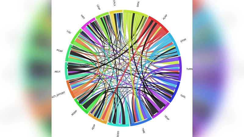
To demonstrate the approach, the authors select the well‑known COCOMO NASA dataset from the PROMISE repository, consisting of 60 software projects with a mixture of ordinal and numeric attributes. Pairwise project similarities are computed using the dissimilarity coefficient of Kaufman and Rousseeuw (1990), while Spearman’s rank correlation is employed to assess variable‑to‑variable relationships, both calculations performed in MATLAB R2009b. The resulting similarity matrix and correlation matrix are fed into Circos via generated configuration files.
The similarity visualization (Figure 2) shows ribbons whose thickness grows with increasing similarity and whose colors progress from gray (perfect similarity) through red, azure, mint, etc., indicating similarity intervals. Notable observations include perfect similarity between projects 33 and 7, strong similarity between 32 and 28, and clusters such as {28, 32, 31, 30, 29}. These patterns reveal that a fixed‑size nearest‑neighbor set (e.g., the classic “k‑nearest neighbor” approach in Estimation by Analogy) is unrealistic for many projects, as the natural neighborhood sizes vary widely. The diagram also serves as a visual clustering tool, highlighting groups of projects that share similar attribute profiles.
The correlation visualization (Figure 3) maps each attribute to a distinct ribbon color; ribbon thickness encodes the absolute value of the Spearman coefficient, and black ribbons denote negative correlations. Strong positive associations are identified, such as between analyst capability (ACAP) and application experience (AEXP), memory constraint (STOR) and time constraint (TIME), and between TIME and database size (DATA). Conversely, negative correlations appear between effort and complexity (CPLX) or programmer experience (LEXP). Importantly, the visualization flags potential multicollinearity issues (e.g., ACAP‑AEXP) that would need to be addressed before building regression or Bayesian models. It also clearly shows which attributes are most strongly linked to effort (ACT_EFFORT), such as lines of code (LOC), data size, and turnaround time, providing immediate guidance for feature selection.
From a technical standpoint, the authors emphasize several advantages of Circos: (1) minimal preprocessing due to its simple input format; (2) dynamic rule‑based styling that can simultaneously encode multiple data dimensions; (3) the ability to hide or emphasize elements globally or locally, facilitating focus on specific subsets; and (4) the aesthetic appeal that can improve communication of complex relationships in publications and reports.
In the concluding section, the paper argues that Circos fills a gap left by conventional scatter, line, or heat‑map visualizations, offering a compact yet richly informative representation of both similarity networks and correlation structures. The authors suggest that incorporating Circos into the early stages of software cost‑estimation workflows can accelerate hypothesis generation, improve data quality checks, and guide the construction of more robust statistical or machine‑learning models. Future work is proposed to explore automated mapping of statistical metrics to ribbon attributes, scalability to larger repositories, and tighter integration with model‑building pipelines (e.g., feeding identified clusters directly into case‑based reasoning engines).
Comments & Academic Discussion
Loading comments...
Leave a Comment