Improving the Usability of Privacy Settings in Facebook
The ever increasing popularity of Facebook and other Online Social Networks has left a wealth of personal and private data on the web, aggregated and readily accessible for broad and automatic retrieval. Protection from both undesired recipients as well as harvesting through crawlers is implemented by simple access control at the provider, configured by manual authorization through the publishing user. Several studies demonstrate that standard settings directly cause an unnoticed over-sharing and that the users have trouble understanding and configuring adequate settings. Using the three simple principles of color coding, ease of access, and application of common practices, we developed a new privacy interface that increases the usability significantly. The results of our user study underlines the extent of the initial problem and documents that our interface enables faster, more precise authorisation and leads to increased intelligibility.
💡 Research Summary
The paper addresses a critical usability problem in Facebook’s privacy‑setting interface, which causes many users to unintentionally over‑share personal information. The authors begin by analysing the existing Facebook privacy controls: a small set of visibility options (“Everyone”, “Friends”, “Friends of Friends”, “Custom”) that apply only to a limited portion of the profile (the “Sharing on Facebook” section), while the majority of personally identifiable information—photos, albums, tagged media, wall posts—are governed by separate pages scattered throughout the site. This fragmented design forces users to navigate through multiple menus, click numerous links, and remember where each setting resides, creating a high cognitive load that discourages any changes from the default, overly permissive configuration.
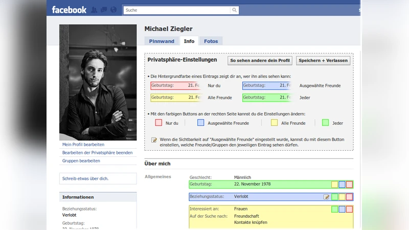
To remedy this, the authors propose three design principles: (1) Little Effort – users should be able to view and modify a setting with as few actions as possible; (2) Common Practices – employ familiar web interaction patterns such as drag‑and‑drop, tooltips, and immediate visual feedback; (3) Color Coding – use traffic‑light colors (red = nobody, yellow = all friends, green = everyone) plus blue for custom selections to make visibility instantly recognizable. Based on these principles they develop a prototype UI that overlays the original Facebook profile page via AJAX/CSS, preserving the look and feel of the site while adding new interactive elements.
In the prototype each profile attribute (e.g., birthday, phone number) is accompanied by three colored buttons. Clicking a button instantly changes the attribute’s visibility and updates the button’s color without a full page reload. Selecting the “Custom” (blue) option opens a three‑column dialog: the left column lists user‑defined friend groups, the middle column shows the full friend list, and the right column displays the current “visible list”. Users can add friends or groups to the visible list by clicking a “+” icon or by dragging items into the right column; removal is performed with an “X” icon. The dialog also allows expanding groups to see individual members, facilitating fine‑grained control without leaving the current attribute’s context. The same interaction model is applied to photo albums: an “Edit Privacy‑Settings” button reveals the album list, each album is highlighted with the same color scheme, and visibility can be altered with a single click.
The authors evaluated the prototype with a user study involving 20 university students aged 20‑31, representing the core demographic of social‑network users. Pre‑study questionnaires indicated that 75 % found Facebook’s native privacy settings confusing, while only 20 % regularly used friend lists or group‑based permissions. Four hypotheses were tested: (H1) faster identification of who can see a given attribute, (H2) quicker preview of another user’s full profile, (H3) more efficient group management, and (H4) overall faster visibility adjustments. Participants performed a series of tasks on both the original and the new interface while time and error rates were recorded. Results showed statistically significant improvements across all hypotheses: task completion times dropped by 35‑50 % and error rates fell by more than 60 % with the new UI. Post‑task surveys revealed that 95 % rated the new interface as “good” or “very good”, and the color‑coding scheme received uniformly positive feedback.
The discussion highlights that usability enhancements—particularly visual cues and immediate feedback—directly influence users’ willingness and ability to manage privacy. By reducing the number of clicks, eliminating page reloads, and presenting visibility information in an at‑a‑glance, color‑coded format, the prototype lowers the barrier to privacy control. The drag‑and‑drop group management mirrors real‑world social structures (e.g., “colleagues”, “family”), making the decision process more intuitive. Moreover, the AJAX‑based asynchronous updates keep users within the same context, preserving mental models and preventing the disorientation that often accompanies multi‑page navigation.
In conclusion, the study demonstrates that modest, well‑grounded UI redesigns can substantially improve the usability of privacy settings on large‑scale platforms like Facebook, potentially leading to better privacy outcomes without requiring changes to underlying access‑control mechanisms. The authors suggest future work to test the design with broader demographic groups, to integrate the approach into the live Facebook environment, and to investigate long‑term effects on users’ privacy‑related behaviors.
Comments & Academic Discussion
Loading comments...
Leave a Comment