The Golden Age of Statistical Graphics
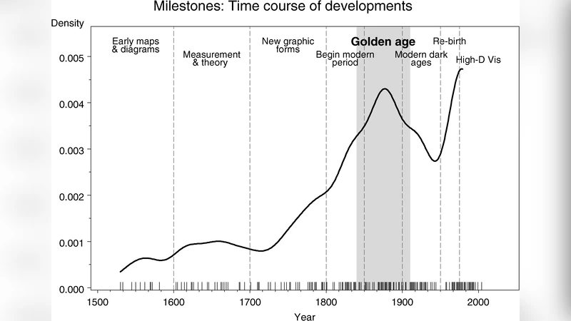
Statistical graphics and data visualization have long histories, but their modern forms began only in the early 1800s. Between roughly 1850 and 1900 ($\pm10$), an explosive growth occurred in both the general use of graphic methods and the range of topics to which they were applied. Innovations were prodigious and some of the most exquisite graphics ever produced appeared, resulting in what may be called the Golden Age of Statistical Graphics.'' In this article I trace the origins of this period in terms of the infrastructure required to produce this explosive growth: recognition of the importance of systematic data collection by the state; the rise of statistical theory and statistical thinking; enabling developments of technology; and inventions of novel methods to portray statistical data. To illustrate, I describe some specific contributions that give rise to the appellation Golden Age.''
💡 Research Summary
The paper identifies the period roughly between 1850 and 1900 as the “Golden Age of Statistical Graphics,” a time when the production and application of visual representations of data expanded dramatically. The author argues that this explosion was not accidental but the result of four interlocking infrastructures. First, modern nation‑states began systematic, large‑scale data collection for demographics, economics, health, and public administration. Regular statistical yearbooks in Britain, France, Germany, and elsewhere supplied a rich raw material base that made large‑scale graphic work feasible. Second, the emergence of statistical theory—Quetelet’s social physics, Galton’s regression, Pearson’s correlation—provided a conceptual framework that linked visual forms directly to quantitative reasoning. Graphs thus became tools for inference, not merely decorative tables. Third, technological advances in printing, lithography, color reproduction, and photography enabled high‑quality, mass‑produced graphics. The ability to reproduce multi‑layered, colored plates cheaply meant that sophisticated visualizations could reach a broad audience. Fourth, innovators invented new graphic idioms that captured time, space, and magnitude in ways previously unseen. William Playfair introduced line and bar charts for time series; Charles Minard created flow maps and the celebrated Napoleon campaign diagram; Florence Nightingale’s polar‑area “coxcomb” chart turned mortality data into a compelling visual argument; Minard’s choropleth maps displayed regional variation with graded hues. These methods combined aesthetic elegance with analytical precision, embodying principles that still guide modern data visualization: clarity, accuracy, and visual appeal.
The article surveys representative works that exemplify the era’s creativity. Playfair’s trade flow diagrams, Nightingale’s nursing charts, Minard’s population density maps, and the myriad statistical atlases produced by governmental agencies illustrate how graphics were employed to influence policy, public opinion, and scientific understanding. The author stresses that the Golden Age was not merely a historical curiosity; it laid the intellectual and technical foundations for contemporary practices such as interactive dashboards, GIS mapping, and data‑driven storytelling. By tracing the convergence of state‑driven data infrastructure, statistical thinking, printing technology, and inventive graphic forms, the paper demonstrates how the 19th‑century surge in statistical graphics created a lasting legacy that continues to shape how we see and interpret quantitative information today.
Comments & Academic Discussion
Loading comments...
Leave a Comment